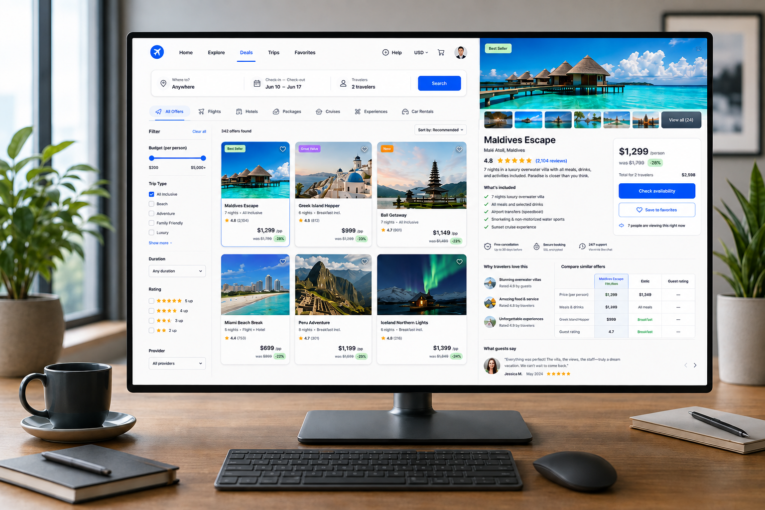
Product & Service UX Best Practices
How to Help Visitors Find, Understand, and Choose the Right Offering
Visitors should be able to easily find the right product or service (aka “Offer” or “Offering”) and determine if it meets their needs.
Some visitors know exactly what they want, while others only know the problem they need to solve. An effective website supports both by making it easy to browse, search, filter, compare, and understand each offering.
When visitors reach an offering page, they should find enough information to determine if it fits their needs and understand the next steps.
Below are 10 UX best practices to consider for your product and service pages (aka “Offer Discovery” and “Offer Experience”) as you evaluate your website.
________________________
1. Give Visitors More Than One Way to Find What They Need
Ask yourself: Can visitors find the right offering whether they know exactly what they want or are still exploring?
Support multiple discovery paths so visitors can find relevant products or services in the way that works best for them. Making offerings easier to discover can reduce dead ends, increase engagement, and help more visitors find options likely to meet their needs.
Some visitors prefer search, while others browse categories, follow related links, or use guides and comparison tools.
Provide multiple ways to discover offerings, especially on complex websites. If one method does not work, visitors should have a clear alternative path forward.
Create a Smoother Journey & Help Visitors Find What They Need Faster >
2. Make Search Work the Way Visitors Search
Ask yourself: Can visitors get useful results without knowing my exact terminology?
Design the search around visitors' language and behavior, not just your internal terminology. Effective search helps people find relevant offerings faster, reduces frustration and dead ends, and can increase engagement and conversion.
Search should recognize exact names, partial terms, synonyms, misspellings, and problem-based queries.
Prioritize the most relevant results and use autocomplete to provide useful, predictable suggestions.
If a search returns no results, offer alternatives such as broader terms, related categories, corrected spellings, or other helpful paths forward.
3. Make Product and Service Listings Useful for Decision-Making
Ask yourself: Can visitors identify promising options without opening every individual product or service detail page?
Give visitors enough information on listing pages to quickly determine which options are worth exploring further. Strong listings reduce unnecessary clicks, make comparisons easier, and help visitors move toward the right product or service more efficiently.
Include relevant details such as a short description, intended audience, price, timeline, availability, key features, or important differentiators.
Present comparable information consistently so visitors can scan, evaluate, and narrow their choices without unnecessary navigation.
4. Make It Easy to Narrow Down the Options
Ask yourself: If visitors face many choices, can they quickly reduce them to the ones that matter?
Help visitors narrow large sets of products or services to the options most relevant to their needs. Effective filtering and sorting reduce decision effort, make comparisons easier, and help visitors reach suitable options more quickly.
Focus filters on the criteria visitors actually use to make decisions, such as price, category, use case, timeline, features, or availability.
Clearly display applied filters, use plain-language labels, and provide meaningful sorting options.
The goal is to help visitors eliminate unsuitable options and focus their attention on the choices most likely to meet their needs.
5. Help Visitors Compare Options Without Losing Their Place
Ask yourself: Can visitors easily understand the differences between similar options?
Make it easy for visitors to compare similar products, plans, or services while preserving the context of their search. Clear comparisons reduce decision effort, prevent unnecessary backtracking, and help visitors choose the option that best fits their needs.
Highlight the differences that matter most, such as price, features, audience, timeline, support, or requirements.
Use consistent attributes and terminology across comparable offerings, and preserve browsing position, filters, and other relevant context when visitors view an option and return.
For more complex decisions, features such as saved items or shortlists can help visitors compare options over time.
6. Clearly Explain What You Offer and Why It Matters
Ask yourself: Can visitors quickly understand what the offering is and why it may be useful to them?
Clearly explain what the product or service is, who it is for, and why it matters. Strong positioning reduces uncertainty, helps visitors recognize whether an offering fits their needs, and can improve consideration and conversion.
At the top of the page, state what the offering is, who it is intended for, and the problem it addresses.
Avoid vague slogans or internal terminology. Explain the benefits to the visitor and, when relevant, highlight meaningful differences from competing options.
Visitors should understand both what they are considering and why it may be the right choice.
Stop Confusing Your Customers & Simply Explain What You Do >
7. Make Important Details Easy to Find and Understand
Ask yourself: Can visitors quickly find the information they need to decide whether the offering is a good fit?
Make important product or service details easy to locate and understand. Clear information reduces uncertainty, helps visitors evaluate fit more efficiently, and can prevent confusion or disappointment later in the customer journey.
Include relevant details such as compatibility, limitations, timelines, deliverables, or how the offering works.
Use clear headings, concise sections, lists, and plain language so visitors can quickly find the information they need.
Clearly distinguish what is included, optional, and excluded rather than requiring visitors to infer the scope from general marketing language.
Use tabs, accordions, and other collapsed content carefully so important details remain easy to discover.
8. Use Visuals and Media to Help Visitors Evaluate the Offering
Ask yourself: Do the visuals help visitors better understand what they are considering?
Use visuals and media to clarify the offering and support evaluation, not simply to decorate the page. Useful visuals can reduce uncertainty, make complex information easier to understand, and help visitors decide whether the offering is right for them.
Depending on the offering, include product photography, screenshots, demonstrations, sample deliverables, process diagrams, or realistic use cases.
Provide enough context for visitors to understand important details such as size, scope, configuration, or practical use.
9. Be Upfront About Price, Availability, and Other Important Conditions
Ask yourself: Can visitors determine whether the offering fits their practical constraints without having to hunt for the answer?
Present important decision factors early so visitors can quickly determine whether an offering is realistic for them. Greater transparency reduces uncertainty, prevents wasted effort, builds trust, and helps more qualified visitors move forward.
Include relevant details such as price, pricing structure, availability, timelines, service areas, additional fees, promotions, policies, or other requirements.
If exact pricing is unavailable, explain how it is determined or provide useful context such as a starting price or typical range.
If an offering is unavailable, provide a meaningful alternative or next step rather than leaving visitors without options.
10. Build Confidence and Make the Next Step Clear
Ask yourself: Does the page address any remaining concerns and make it clear what to do next?
Give visitors the reassurance and direction they need to move forward. Strong trust signals and a clear primary action can reduce hesitation, increase qualified conversions, and help visitors act with greater confidence.
Support important claims with credible evidence such as testimonials, reviews, case studies, credentials, results, or sample work. Provide enough context for that evidence to be meaningful rather than relying on generic praise.
Address common questions before prompting visitors to act, and keep related recommendations secondary to the current offering.
Provide a clear primary action, such as Buy Now, Request a Quote, Schedule an Appointment, Start a Trial, or Contact Us.
Once visitors are confident in the offering, the next step should be immediately clear.
________________________
A strong product or service experience enables visitors to make confident choices
An effective product or service experience helps visitors move naturally through:
What options are available? → Which one fits my needs? → Do I understand what I’m getting? → Am I ready to move forward?
Navigation, search, listings, filters, comparison tools, offering pages, visuals, pricing, evidence, and calls to action should work together to support this decision-making process.
When they do, visitors spend less time searching and second-guessing, and more time evaluating the right options. This helps improve engagement, increase qualified conversions, and reduce lost opportunities.
Next steps
If visitors struggle to find your products or services, compare options, or access the information they need to make a decision, the experience may be creating unnecessary friction.
Fegan Consulting assesses how visitors discover, understand, compare, and evaluate products and services from an expert, accessibility-focused UX perspective. You receive clear, prioritized recommendations to make your offerings easier to find, understand, and act on, without defaulting to a costly redesign.
Let’s Work Together
If you’d like to explore working together, please complete the form with a few details about your project. I will review your message and get back to you within two business days.