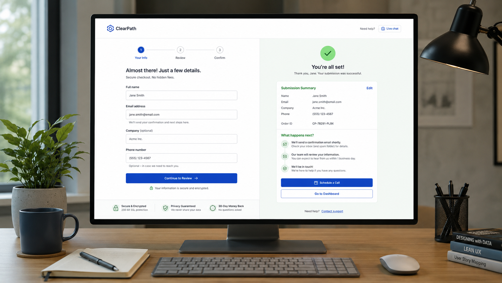
Conversion UX Best Practices
How to Help Visitors Complete Their Goal and Know What Happens Next
Once visitors choose to act, your website should make completing that action clear and straightforward.
Unnecessary steps, confusing fields, unexpected costs, and unclear feedback can quickly create friction, whether visitors are making a purchase, scheduling an appointment, requesting a quote, registering, or submitting a form.
The post-completion, aka “post-conversion,” experience is equally important. Visitors should know their action was successful, what to expect next, and how to manage or follow up if needed.
Below are nine best practices for conversion and post-conversion to consider as you review your website.
________________________
1. Make the Path to Completion Clear
Ask yourself: Once visitors decide to act, is it obvious what they should do next?
Ensure the primary conversion path is easy to identify, minimizing competing actions, unnecessary steps, and distractions. A clear path reduces friction and helps more visitors successfully complete high-value actions.
Use button labels that clearly indicate the next step, such as Schedule Consultation, Continue to Payment, or Submit Application.
Avoid artificial urgency or pressure that pushes visitors to act before they are ready.
Explore How To Clear The Path To Conversion >
2. Preserve Progress and Selections
Ask yourself: Can visitors move through the process without losing their work?
Preserve visitor progress throughout multi-step processes so they can go back, edit choices, or recover from errors without starting over. Protecting their work reduces frustration and abandonment while making complex conversions easier to complete.
Clearly communicate progress and keep selected products, dates, options, and saved items visible and editable.
For important transactions, provide a clear summary before finalizing so visitors can review key details and make corrections without restarting.
3. Be Clear About the Total Cost
Ask yourself: Do visitors understand what they will pay before they commit?
Make the expected total cost clear as early as possible so visitors can make informed decisions with confidence. Pricing transparency builds trust and reduces last-minute abandonment caused by unexpected charges.
Include all applicable fees, taxes, shipping, discounts, and recurring charges. If exact pricing is unavailable, provide an estimate or explain what determines the final cost.
Avoid introducing new or unexpected charges at the final step.
4. Make Forms Easy to Complete
Ask yourself: Does my form request only necessary information and make each question easy to answer?
Design forms to minimize unnecessary effort so visitors can complete them quickly and confidently. Easier forms reduce frustration, improve completion rates, and help prevent valuable conversions from being lost.
Remove unnecessary fields and organize longer forms into clear, logical sections.
Use persistent labels, clearly distinguish required from optional fields, and choose input controls that match the information being requested.
Support browser autofill, password managers, copy-and-paste, and appropriate mobile keyboards.
The goal is to reduce overall effort, not simply the number of screens.
5. Make Errors Easy to Fix
Ask yourself: If something goes wrong, can visitors quickly recover?
Design errors to help visitors recover without unnecessary effort. Clear, actionable feedback reduces frustration, prevents abandonment, and helps more visitors successfully complete important actions.
Make error messages specific, explain how to resolve the issue, and clearly identify the affected field.
Preserve all valid information so visitors do not have to re-enter unrelated details.
When processing an action, provide immediate feedback so visitors know the system is working and avoid duplicate submissions.
6. Make the Final Commitment Transparent
Ask yourself: Do visitors fully understand what they are agreeing to before they finish?
Make the final commitment clear so visitors can proceed with confidence. Transparent terms reduce hesitation, prevent surprises, build trust, and help protect against avoidable cancellations, disputes, or abandoned conversions.
Avoid unnecessary account creation and make guest or non-account completion easy to find when appropriate.
Clearly explain payment, financing, subscription, and recurring terms before visitors select them.
For consequential actions, provide a clear review step and disclose important fees, restrictions, cancellation terms, or other material information before the final action.
The final button should clearly state the consequence, such as Place Order or Submit Final Application.
7. Clearly Confirm Completion
Ask yourself: After visitors finish, are they completely certain the action succeeded?
Provide immediate, unmistakable confirmation after important actions. Clear confirmation reduces uncertainty, prevents duplicate submissions, and reinforces trust at a critical moment in the customer experience.
Include relevant details such as:
Confirmation or reference number
What was submitted or purchased
Total cost
Appointment or delivery information
Where a confirmation message was sent
Visitors should not need to refresh the page, check their email, or wonder whether the action was successful.
Understand How To Keep Your Visitors Reassured >
8. Explain What Happens Next
Ask yourself: Do visitors know what to expect after completing the action?
Set clear expectations for what happens after completion so visitors know what will happen, when it will happen, and whether they need to do anything next. Clear follow-up reduces uncertainty, builds trust, and can lower avoidable support questions.
Use specific timeframes and next steps instead of vague language such as We’ll be in touch soon.
Provide clear options to track, modify, cancel, or get support when applicable. If plans change, communicate delays promptly and update expectations.
Respect communication preferences as the relationship continues, and keep necessary transactional messages separate from marketing communications.
9. Make Accounts Useful After Conversion
Ask yourself: If visitors return later, can they easily manage what matters to them?
Design account areas around the tasks customers are most likely to return to complete. A useful account experience reduces effort, encourages self-service, and can lower support needs while strengthening the ongoing customer relationship.
Make sign-in easy to find and return visitors to their intended task after authentication.
Prioritize common account tasks such as:
Viewing orders or bookings
Tracking status
Finding past activity
Managing addresses or payment methods
Updating preferences
Accessing support
Keep the account experience focused on customer needs and tasks rather than promotional content.
________________________
A Good Conversion Experience Builds Confidence
A strong conversion experience guides visitors naturally from:
I'm ready to act. → I know what to do. → I know it worked and what happens next.
When the entire journey is clear, from taking action through confirmation and follow-up, visitors are more likely to complete important actions, trust the organization, and continue the relationship after conversion.
The experience should remain clear, useful, and supportive even after the final button is clicked.
Next steps
If visitors abandon forms, struggle to recover from errors, encounter unexpected costs, or are unsure what happens after completing an action, your conversion experience may be creating unnecessary friction.
Fegan Consulting evaluates conversion paths, forms, checkout experiences, confirmations, and post-conversion journeys from an expert, accessibility-focused UX perspective. You receive clear, prioritized recommendations to make important actions easier to complete and manage, without defaulting to a costly redesign.
Let’s Work Together
If you’d like to explore working together, please complete the form with a few details about your project. I will review your message and get back to you within two business days.