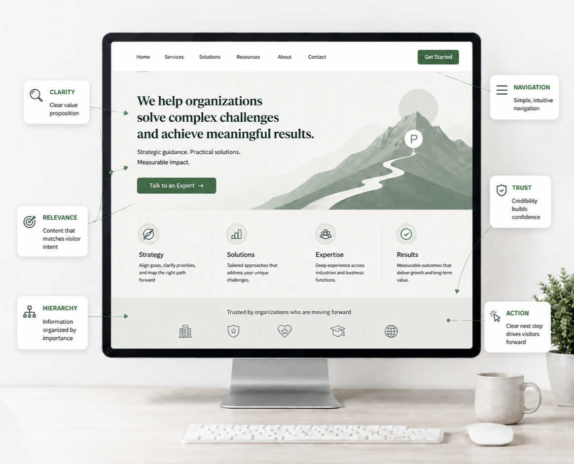
Homepage UX Best Practices: Help Visitors Understand, Explore, and Take Action
Your homepage does not need to explain everything about your organization.
But it does need to help visitors quickly understand where they are, determine whether you can help them, and decide what to do next.
Although this may seem simple, many homepages demand more effort from visitors than needed.
Common issues include vague marketing language, promoting too many items, assuming prior knowledge, using attractive yet uninformative imagery, and overwhelming visitors with too many options.
An effective homepage provides clear guidance. It introduces your organization, establishes relevance and trust, helps visitors explore your offerings, and presents a clear path forward.
Below are key homepage best practices to consider as you enhance your website.
1. Make it immediately clear what you do
One of the first questions new visitors have is also the simplest: What does this organization do?
Do not assume the answer is obvious.
Visitors may arrive from Google, social media, advertisements, emails, referrals, or shared links. They may know little about your organization when they reach your homepage.
Your headline and introductory copy should provide enough context for visitors to understand your purpose within seconds.
Compare:
Vague: Innovating Possibilities for a Better Tomorrow
Clear: IT Support and Cybersecurity Services for Small Businesses
The second version may be less creative, but it immediately communicates what the organization offers. When visitors are orienting themselves, clarity is more effective than cleverness.
Learn More About Why Homepage Clarity Matters >
2. Help visitors recognize whether you are for them
Knowing what you do is only the beginning.
Visitors are also asking: Is this for someone like me?
For example, a financial consultant for small business owners should make this focus clear on the homepage, rather than requiring visitors to search for it. Similarly, a software company serving healthcare organizations should establish relevance early.
You can communicate your audience through:
Your headline and supporting copy
Examples of who you help
Industries or customer types you serve
Problems or goals you address
Testimonials and case studies
Relevant imagery
You do not need to state, "Our target audience is..." The goal is to help the right visitors recognize themselves in the experience.
3. Explain why what you offer matters
Your homepage should go beyond describing what you offer. Help visitors understand the benefits: How will this help me?
A feature tells visitors what something does. A benefit explains why they should care.
For example:
Feature-focused: Our platform includes automated reporting.
Benefit-focused: Create recurring reports automatically so your team spends less time compiling data manually.
Both statements are useful, but the second links the feature to a valued outcome.
When reviewing your homepage, look for areas where you describe your company, products, or capabilities without explaining their benefits to customers.
4. Give people a reason to choose you
Visitors rarely evaluate your organization in isolation. They may have several browser tabs open, compare different providers, or have expectations shaped by other businesses.
Your homepage should clearly communicate what sets your organization apart: Why should I choose this organization?
That does not mean filling the page with claims such as:
Best-in-class
Industry-leading
Innovative
Customer-focused
Trusted solutions
These phrases are not distinctive, as any competitor could make similar claims.
Instead, focus on distinctions that matter to your customers. Highlight advantages such as specialized experience, unique methodologies, faster turnaround times, proprietary technology, distinctive expertise, flexible processes, or measurable outcomes.
Explain the difference and, whenever possible, provide evidence for it.
5. Show visitors the range of what you offer
Visitors should not need to navigate multiple pages to understand your offerings. Your homepage should provide a high-level overview.
If you provide several services, introduce the primary service categories.
If you sell many products, show the major product groups.
If you serve different needs, help visitors understand the available paths.
The goal is not to display your entire catalog on the homepage.
Instead, answer: Do you offer something that could help me?
Then, provide clear links for further information.
6. Do not give everything equal importance
Your homepage should answer: What should I pay attention to first?
A common homepage problem is trying to make every business priority equally prominent.
A new service needs attention.
Marketing wants to promote an event.
Leadership wants the company mission featured.
Someone wants the latest blog post highlighted.
Another team needs a newsletter signup.
Sales wants a consultation button.
As a result, all elements compete for attention. When everything appears important, nothing stands out.
Decide what visitors need to understand first and which offerings or actions are most important. Use homepage hierarchy to reflect these priorities.
Secondary information should remain accessible but not equally prominent.
7. Give visitors reasons to trust you
Visitors may understand what you offer and still hesitate.
Their next question is often: Why should I believe you?
Trust should not rely solely on your own statements. Support your claims with evidence.
Depending on your organization, useful credibility signals might include:
Customer testimonials
Reviews
Case studies
Measurable results
Client or partner logos
Certifications or licenses
Awards
Professional affiliations
Years of relevant experience
Media coverage
Guarantees
Transparent contact information
Choose evidence that is meaningful to your visitors. A few specific, relevant proof points often inspire more confidence than many logos or generic testimonials.
8. Create a homepage people can easily scan
Most visitors will not read every sentence on your homepage from top to bottom.
They scan with one goal in mind: Can I quickly find what matters to me?
They notice headlines, images, buttons, short sections, lists, and other visual cues before deciding where to focus. Your homepage should support this behavior.
Use a clear hierarchy so visitors can quickly distinguish:
The primary message
Supporting information
Major offerings
Important evidence
Primary actions
Secondary information
Avoid making all sections visually dominant. Consistent headings, thoughtful spacing, clear grouping, and limited emphasis make a homepage easier to understand without changing the core message.
9. Use imagery to explain, not simply decorate
An attractive homepage is not necessarily an informative one.
Generic images such as handshakes, skylines, conference rooms, or abstract graphics may enhance visual appeal but often provide little insight into what the organization does. Whenever possible, use imagery that reinforces understanding.
That might include:
Your actual products
Your team providing a service
Customers using your product
Completed projects
Your facility or environment
Diagrams explaining a process
Illustrations clarifying an unfamiliar concept
Ask a simple question: What does this image help the visitor understand?
If the answer is "nothing," the image is likely decorative rather than informative. Decorative imagery is acceptable, but it should not distract from essential information.
10. Keep promotions from taking over the homepage
Homepages often become prime real estate for every campaign, announcement, event, sale, product launch, or organizational initiative.
Promotional content can belong on your homepage, but it should not prevent visitors from understanding your core business.
A first-time visitor should not land on your homepage, see a large banner promoting an upcoming webinar, and still have no idea what your company does.
They want to quickly understand: What is most important for me to know here?
Promotions should enhance the visitor experience rather than overshadow it.
Before adding another banner or announcement, ask:
How important is this to most visitors?
Is it more important than our core offering?
Does it need homepage visibility?
How long should it remain?
What will it replace or compete with?
Homepage space is limited, so visitor attention should be managed carefully.
11. Be careful with rotating banners and carousels
A carousel may seem like an easy way to fit several messages into one area, but visitors may not see subsequent messages.
Content may rotate before visitors finish reading, controls can be missed, important information may be hidden, and auto-rotating content can create accessibility and usability issues.
If something is important enough that visitors need to see it, consider whether it should simply remain visible.
Ask a simple question: Will the visitor see the important information without waiting or interacting?
If you do use a carousel:
Put the most important message first.
Do not hide essential information exclusively on later slides.
Give visitors control over movement.
Make the controls obvious.
Keep the number of slides limited.
Make sure the homepage still makes sense if someone never advances it.
Avoid using a carousel only to accommodate multiple stakeholder requests.
12. Make it obvious what visitors can click
Visitors should not have to experiment to understand how your homepage functions.
Buttons should look like buttons.
Links should be recognizable as links.
Clickable cards should look interactive.
Static content should not accidentally look clickable.
Consistency is essential. If a button style represents a primary action, use it consistently rather than introducing multiple unrelated styles.
Good interface design removes the question: Can I click this?
This allows visitors to focus on deciding whether to click, rather than questioning how to interact.
13. Give visitors clear places to begin
Once visitors understand your offerings, your homepage should guide them to the next steps on your website.
They want to quickly understand: Where should I start?
Ask yourself what your most common visitors are trying to accomplish.
Maybe they want to:
Explore your services
Browse products
Understand pricing
Find a location
Schedule an appointment
Request a quote
View examples of your work
Read educational resources
Contact your team
These common goals should have clear pathways.
Do not require visitors to understand your organizational structure before using your website. Design starting points based on visitor objectives.
14. Support visitors who know what they want and those who do not
Not everyone arrives at your homepage in the same mindset.
One visitor may know exactly what they need: "I want to schedule an appointment."
Another may still be researching: "I'm not even sure which service is right for me."
An effective homepage serves both types of visitors by answering: Can I move forward based on what I already know?
Ensure high-intent tasks are easily accessible, while also offering sufficient explanation for those still exploring.
Do not force every visitor through the same sequence. Your homepage should make it easy for visitors to learn, explore, decide, and act in line with their needs.
15. Help people choose when the options are complicated
Sometimes simply showing your services is not enough.
Imagine a visitor sees four options:
Strategy
UX Audit
Accessibility Review
Ongoing Advisory
They may understand what each service is and still wonder: Which option is right for me?
When the answer is not obvious, provide guidance.
You might explain:
Who each option is best for
What problem each option solves
When someone should choose one over another
What the typical starting point is
How the options differ
Which service you recommend for a common situation
The goal is not to make every decision for your customers, but to avoid passing unnecessary complexity to them.
If selecting among your offerings requires significant internal knowledge, your website should help close this gap.
16. Make the next step clear
Eventually, your homepage needs to answer one final question: What should I do next?
Your primary call to action should reflect the most logical next step for someone who is ready to continue.
Depending on your business, that might be:
Explore Services
Shop Products
Schedule a Consultation
Request a Quote
Find a Location
Start Your Application
View Plans
Contact Us
Avoid presenting visitors with several equally prominent actions.
Be cautious about requesting too much information or commitment at an early stage.
A new visitor may not be ready to "Book a Sales Call." They may first need to understand your services, review pricing, see examples, or learn about your process.
A strong call to action should logically follow the preceding information.
Summary
Your homepage should guide visitors, not overwhelm them.
A successful homepage is not the one with the most content, animations, or impressive design. It is the one that helps visitors make progress.
Visitors should be able to arrive, understand your offerings, determine your relevance, trust your organization, find what they need, and confidently take the next step.
When these fundamentals are in place, the homepage becomes more than an introduction. It serves as a guide to the broader experience.
Next steps
If you are unsure whether your homepage helps visitors understand your organization and move confidently to the next step, Fegan Consulting can help.
I evaluate websites using an expert, accessibility-focused UX approach to identify usability issues, unclear messaging, unnecessary friction, and opportunities to enhance the visitor experience. You will receive clear, prioritized recommendations to help you make informed website decisions without resorting immediately to a costly redesign.
Let’s Work Together
If you’d like to explore working together, please complete the form with a few details about your project. I will review your message and get back to you within two business days.