Information Architecture Best Practices: How to Make Your Website Easier to Navigate
If visitors cannot find what they need, they may assume the information is missing or that your organization does not provide it. Often, the problem lies in how content is organized, not in the content itself.
This is where information architecture becomes essential.
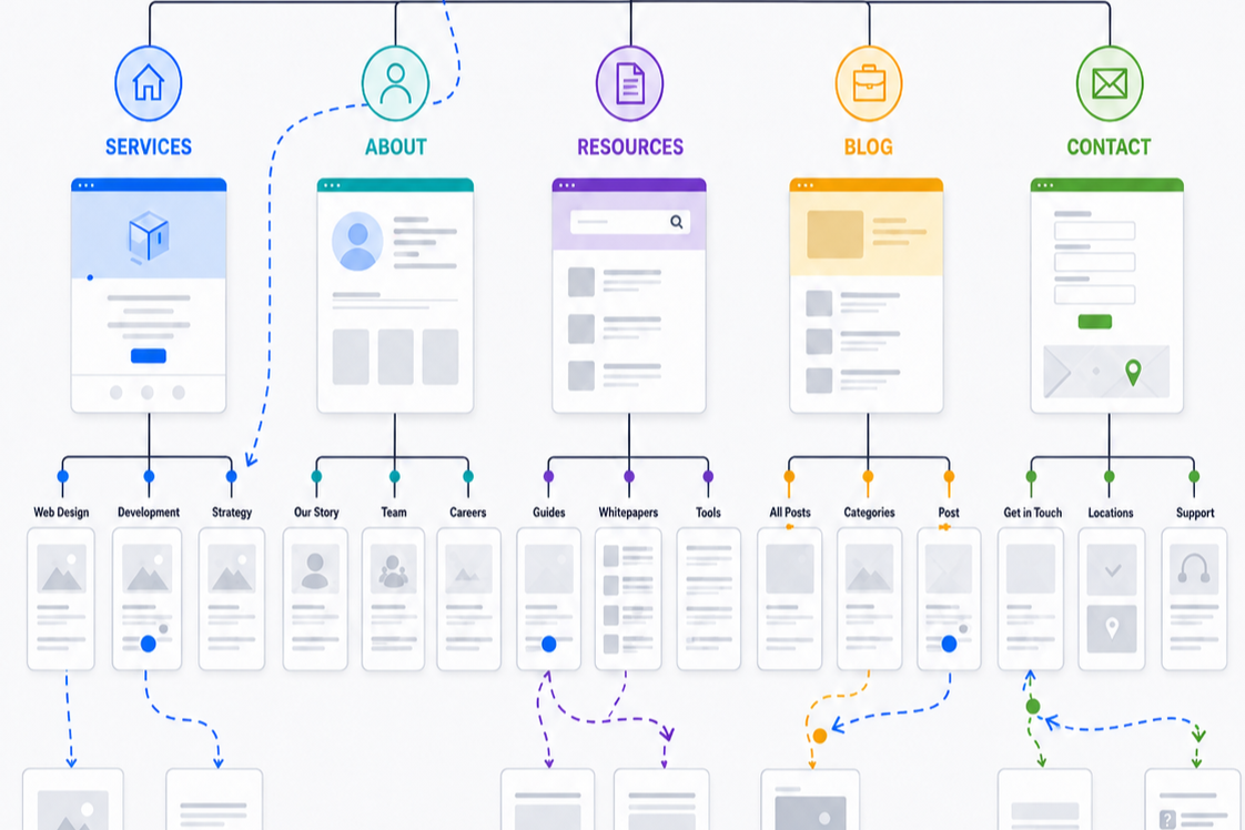
Information architecture serves as your website’s structural blueprint. It defines how content is grouped, how navigation functions, where information appears, and how visitors move between topics.
When information architecture is effective, visitors can easily find what they need without thinking about the underlying structure.
Below are 12 best practices for information architecture to consider when reviewing your website.
________________________
1. Organize Your Website Around What Visitors Need
Ask yourself: Is my website organized around what visitors are trying to accomplish?
A common mistake is structuring a website around departments, programs, internal terminology, or the organization’s internal structure.
Visitors typically arrive with specific goals, such as understanding your services, comparing options, finding pricing, seeking support, scheduling an appointment, or contacting your team.
Your website should reflect those goals.
If visitors must understand your internal organization to find what they need, your website structure is likely too complex.
Learn More About Organizing Your Website Around User Goals >
2. Keep Your Website Structure Simple and Manageable
Ask yourself: Is my website simple enough to navigate without oversimplifying the content?
A shallow structure can overwhelm visitors with too many choices, while a deep structure can require navigating through excessive levels.
The right balance depends on the size and complexity of your website.
Smaller websites benefit from fewer categories and levels. Larger websites may require more structure to help visitors narrow their choices.
Look for signs of unnecessary complexity, such as expanding menus, overlapping categories, buried information, or frequent backtracking.
Learn More About Streamlining Your Website & Creating An Intuitive Navigation >
3. Group Related Information Together
Ask yourself: Does related information appear together in ways that make sense to visitors?
Visitors focus on topics and tasks rather than individual webpages.
Someone evaluating a service may look for pricing, examples, FAQs, timelines, and next steps. These elements should be connected, not scattered across unrelated sections.
Categories should also be distinct enough that visitors can confidently choose between them.
If labels like “Solutions,” “Services,” “Capabilities,” and “Expertise” contain similar information, consider combining, renaming, or reorganizing these categories.
4. Put Information Where Visitors Expect to Find It
Ask yourself: Is important information located where visitors would naturally look for it?
Visitors arrive with expectations shaped by other websites.
They often expect pricing near products or services, contact information under Contact, FAQs near the topics they address, and company information under About.
You do not need to follow conventions blindly, but any unexpected placement should offer a clear benefit.
If visitors repeatedly overlook important information, consider whether its location, rather than the content itself, is the issue.
5. Keep Your Main Offerings Easy to Distinguish
Ask yourself: Can visitors easily tell what I offer versus content that supports it?
Articles, case studies, guides, webinars, news, and resources can educate visitors and build credibility.
These resources should not compete with your primary products, services, or programs.
Visitors should quickly understand the difference between what your organization provides and content that helps them learn more about it.
Supporting content should enhance the visitor journey, not obscure the main reason for visiting your website.
6. Use Navigation Patterns Visitors Already Understand
Ask yourself: Does my navigation behave the way visitors expect websites to work?
Visitors are familiar with many common website conventions.
They generally expect logos to link home, menus to open predictably, links to behave like links, and navigation to appear in familiar locations.
Using these patterns reduces the effort required to navigate your website.
Distinctive design is valuable, but visitors should not need to relearn basic navigation to use your website.
7. Make Important Pages Easy to Find
Ask yourself: Are the pages visitors need most among the easiest pages to reach?
Primary navigation indicates what is most important.
Start by identifying the main reasons people visit your website, such as products, services, pricing, scheduling, support, or contact information.
These paths should be easier to access than secondary content such as company history, careers, or press releases.
Not every important page needs to be in the top-level menu, but key destinations should be obvious and easy to reach.
8. Use Navigation Labels That Clearly Explain What’s There
Ask yourself: Can visitors predict where each navigation link will take them?
Navigation labels serve as signposts for visitors.
Vague terms like “Explore,” “Experience,” “Insights,” or “Solutions” may sound appealing but often require interpretation.
Descriptive labels such as “Services,” “Pricing,” “Customer Stories,” or “Articles & Guides” make destinations easier to predict.
Use language your visitors understand, rather than internal terminology.
9. Help Visitors Understand Where They Are
Ask yourself: Can visitors easily tell where they are within my website?
Not everyone enters through the homepage.
Visitors may arrive directly on an interior page from search, email, social media, advertising, or another website. Each page should provide enough context to help visitors understand their location within the website.
Helpful cues may include:
Clear page titles
Descriptive headings
Active navigation states
Breadcrumbs
Section navigation
Visitors should not need to reconstruct their path to understand how a page fits within the website.
10. Make It Easy to Explore Related and Broader Content
Ask yourself: Can visitors easily move from a detailed page to broader or related information?
Visitors rarely follow one perfect path.
Someone viewing a product may want to compare alternatives. Someone reading an article may want to explore the broader topic. Someone reviewing one service may discover another is a better fit.
Make it easy for visitors to move between related and broader content without repeatedly returning to the homepage or relying on the back button.
Treat every page as both a destination and a potential starting point.
11. Give Visitors an Easy Way Back to the Homepage
Ask yourself: Can visitors easily return to the homepage from anywhere on my website?
The homepage serves as an important point for orientation and recovery.
Visitors may return there when they want to start over, explore another part of the website, or better understand the organization.
Most visitors expect the logo to link to the homepage.
Following this familiar convention offers a simple and predictable way for visitors to reset their experience.
12. Help Visitors Keep Their Place as They Move Through the Website
Ask yourself: Can visitors move through my website without repeatedly losing their place?
Effective information architecture helps visitors understand how pages relate to each other as they navigate.
Someone might go from a service to a case study, from search results to a detail page, or from a filtered product list to an individual product and back.
The experience should provide enough context for visitors to answer:
Where am I?
Where did I come from?
Where can I go next?
Navigation should remain consistent across the website. Avoid unexpected changes to menu order, terminology, location, or behavior unless there is a compelling reason.
The less visitors need to reconstruct their path, the easier your website will be to use
________________________
Do not forget about mobile navigation
A structure that is clear on desktop may become confusing within a smaller mobile menu.
Ensure important destinations remain easy to reach, categories are understandable, nested navigation is manageable, and visitors can still identify their location.
The interface may differ between desktop and mobile, but the underlying organization must remain clear.
Good information architecture should feel almost invisible
When information architecture is effective, visitors likely will not notice it.
They simply find what they need.
They understand their options, know where they are, and move through the website without repeatedly stopping to decide what to do next.
That is the goal.
Your website should reflect how visitors naturally seek and understand information, rather than requiring them to learn your organization’s internal logic before accomplishing their goals.
Next steps
If important information is difficult to find, navigation is confusing, or visitors often get lost between pages, the underlying structure may be the cause.
Fegan Consulting evaluates website organization, navigation, content relationships, and visitor pathways from an expert, accessibility-focused UX perspective. You receive clear, prioritized recommendations to make your website easier to understand and use, without defaulting to a costly redesign.
Let’s Work Together
If you’d like to explore working together, please complete the form with a few details about your project. I will review your message and get back to you within two business days.