Every Informative Image Should Have Meaningful Alt Text
When every informative image has an equally meaningful text alternative, more visitors can understand, navigate, and engage with your website.
Images often communicate information that words alone do not.
A photograph may establish credibility, a chart may explain performance, an icon may identify an action, and a diagram may simplify a complex concept. Visitors who use screen readers, or who can't view images for any reason, should still receive the same information.
Alternative text, commonly called alt text, provides that equivalent experience. Rather than simply announcing that an image exists, good alt text communicates the information or purpose the image contributes to the page.
The best alt text focuses on meaning, not appearance. Instead of describing every visual detail, it explains what visitors would lose if the image weren't there.
Common User Experience (UX) Roadblocks
Leaving alt text blank for informative images: Every image that communicates information or supports an important action should include a meaningful text alternative. Without it, some visitors lose access to content that others receive visually.
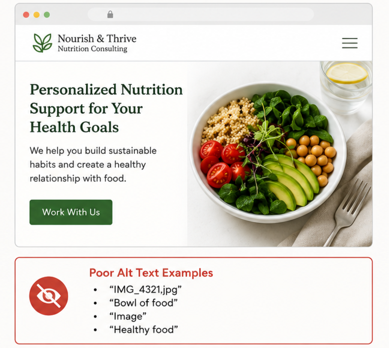
Using generic descriptions: Labels such as "image," "graphic," or file names rarely provide useful information. Write alt text that explains the image's purpose instead of simply identifying it as an image.
Describing appearance instead of purpose: Good alt text isn't a visual inventory. Focus on what the image contributes to the page, whether it's identifying a person, explaining a concept, illustrating a process, or supporting a decision.
Ignoring linked images: Images that function as links should clearly communicate where the link leads or what action it performs. Visitors using screen readers should be able to understand the destination without seeing the image.
Giving decorative images unnecessary descriptions: Not every image needs alt text. Images used purely for decoration should generally be marked as decorative so screen readers can skip them instethat screen readers can skip them, rather thanad of interrupting the reading experience with unnecessary announcements.
What the research tells us
WebAIM's WebAIM's annual Million study consistently identifies missing or poor alternative text as one of the most common accessibility issues on the web.
Its 2026 analysis found that 53.1% of the world's top one million home pages contain at least one image with missing alternative text, making it the second most common automatically detectable WCAG failure.
Across more than 66.6 million images, 16.2% lacked alternative text entirely, averaging 10.8 instances of missing alt text per homepage. WebAIM also found that 45% of images missing alternative text were linked images, meaning many visitors using assistive technologies encountered navigation elements with no meaningful accessible name.
Even when alternative text is present, quality remains a challenge. 10.8% of images with alt text used generic or low-value descriptions, such as "image," "graphic," file names, or nearby text that was repeated, providing little additional context.
Taken together, WebAIM concluded that more than one in four images on popular home pages have missing or poor alternative text, demonstrating that this remains one of the web's most persistent accessibility problems.
The Web Content Accessibility Guidelines (WCAG) require meaningful text alternatives for non-text content because visitors who cannot see an image should still receive the information it communicates.
Although alt text is first and foremost an accessibility requirement, it also helps search engines better understand image content, providing additional SEO benefits.
Why this matters
Visitors shouldn't lose access to important information simply because it's presented visually.
Organizations that write meaningful alternative text create more inclusive experiences, improve accessibility, and ensure their content can be understood in a wider range of browsing situations. Rather than treating alt text as a technical requirement, they recognize it as another opportunity to communicate clearly.
The best websites ensure that meaningful information remains accessible whether visitors can see the image or not.
Three UX Priorities for Accessibility Optimization
Priority #1: Write alt text that communicates purpose
Ask yourself what information the image adds to the page. If the image disappeared, what would visitors no longer understand? The answer to that question is usually what your alt text should communicate. Focus on meaning rather than describing every visible detail.
Priority #2: Distinguish informative images from decorative ones
Not every image requires a description. Images that communicate information should include meaningful alt text, while purely decorative images should generally be marked as decorative so screen readers ignore them. This reduces unnecessary interruptions and creates a smoother browsing experience.
Priority #3: Review alt text as part of your content process
Alternative text shouldn't be an afterthought. Whenever new images are added to your website, review whether they communicate information, support navigation, or influence decision-making. If they do, write meaningful alt text before publishing the page.
A quick website review
Review your website, then ask yourself:
Do all informative images include meaningful alternative text?
Does the alt text communicate the image's purpose or content?
Are linked images given descriptive accessible names?
Are decorative images excluded from assistive technology?
Does alt text avoid generic labels such as "image" or file names?
Do complex visuals provide equivalent textual information?
Is alt text concise and appropriate for the surrounding context?
Can visitors who cannot see the image still understand its contribution?
Does every informative image support the visitor's understanding?
Would the page still make sense if the images weren't visible?
If several of these questions are difficult to answer, your website may be preventing some visitors from accessing information that others receive visually.
Great accessibility isn't about describing pictures; it's about preserving meaning. When every informative image has an equally meaningful text alternative, more visitors can understand, navigate, and engage with your website.
Next steps
If your website's images aren't fully accessible, I can help you identify where missing, unclear, or ineffective alternative text may be preventing visitors from accessing important information. I work with organizations to ensure images communicate effectively for everyone while improving accessibility, usability, and the overall website experience.
Let’s Work Together
If you’d like to explore working together, please complete the form with a few details about your project. I will review your message and get back to you within two business days.