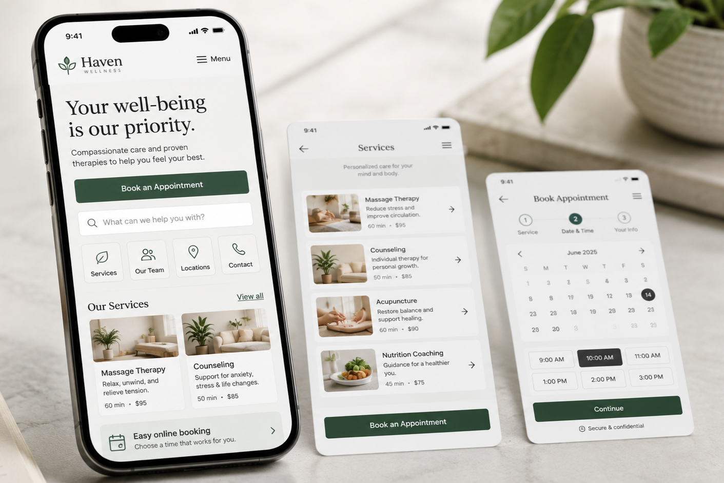
Mobile UX Best Practices
How to Make Your Website Easier to Use on a Mobile Device
A website optimized for desktop will not necessarily perform well on a mobile device.
Mobile users have limited screen space, rely on touch, and often need to complete tasks quickly. Navigation, search, forms, listings, and content must adapt to these constraints.
Effective mobile UX focuses on making key information and actions easy to find, understand, and use, rather than simply shrinking the desktop experience.
Consider these eight mobile UX best practices when evaluating your website.
________________________
1. Make Important Pages and Actions Easy to Reach
Ask yourself: Can mobile visitors quickly find what they need?
Prioritize key destinations and common actions for mobile users.
Depending on the website, that might include products, services, appointments, locations, contact information, account access, search, or a shopping cart.
Avoid placing high-priority tasks deep within menus or prioritizing promotions over essential navigation.
Help Visitors Complete Tasks Effortlessly >
2. Use Mobile Navigation Patterns Visitors Already Understand
Ask yourself: Does my mobile navigation behave the way visitors expect?
Mobile menus should open, close, expand, and navigate in a predictable manner.
Clearly differentiate between controls that expand menus and links that open pages. Maintain familiar browser behaviors, including the Back button, and provide access to overview pages such as View All Services or Shop All Shoes when appropriate.
Ensure visitors can explore without unintentionally opening pages or becoming confined to narrow sections.
Build Predictable Navigation >
3. Make Search, Filtering, and Sorting Easy to Use
Ask yourself: Can visitors quickly find and narrow what they need on a small screen?
If search is essential, ensure it is easy to find and use on mobile, rather than hiding it within menus.
For large sets of products, services, or results, keep Filter and Sort controls easily accessible. Applied filters should remain visible, be easy to modify or remove, and not trigger repeated page reloads or loss of context.
The goal is to help visitors narrow their options efficiently, without repeatedly opening, closing, or reselecting filters.
4. Keep Mobile Listings Compact but Useful
Ask yourself: Can visitors compare several options without opening each page individually?
Mobile listings must balance providing information with limited screen space.
Provide enough information to help visitors distinguish between options, such as:
Name
Price
Important features
Availability
Ratings or other useful indicators
Avoid oversized cards that require excessive scrolling, but retain enough information so visitors do not need to open each item to understand the basics.
Ensure each option is visually distinct so visitors can easily identify the corresponding image, price, or action.
5. Keep Important Content Easy to Find and Interact With
Ask yourself: Can visitors access important information and interactions without excessive scrolling or guessing?
Essential product or service information must be easy to find on mobile.
Present key details such as pricing, availability, specifications, policies, and primary actions in a clear vertical flow, rather than dispersing them across hidden tabs or separate pages.
If additional content or interactions are available, such as more images, expandable sections, or horizontally scrollable content, make this clear to users.
For interactive selections, place controls near the results they affect. Users should see the effect of selecting a color, date, size, or configuration without unnecessary scrolling.
6. Make Touch-Based Media Easy to Use
Ask yourself: Do images, galleries, and other media behave naturally on a touchscreen?
Mobile users expect media to respond to familiar touch interactions. When appropriate, support actions such as swiping between images, tapping thumbnails, zooming into details, and easily closing full-screen views.
Controls must be large enough for reliable tapping, and users should be able to identify when additional images or interactions are available.
Media should simplify evaluation, not introduce a new interface for users to learn.
7. Keep Primary Actions and Forms Easy to Use
Ask yourself: Can visitors comfortably take action without having to fight the interface?
Primary actions such as Add to Cart, Book Appointment, or Request a Quote must remain easily accessible on longer mobile pages.
Sticky buttons can be helpful, but should not obscure important content, overlap with other overlays, or occupy excessive screen space.
Forms must also be optimized for mobile input. Use appropriate field types and keyboards, support autofill, keep labels visible, and ensure touch targets are sufficiently large.
Mobile users should focus on completing tasks, not correcting issues caused by the form.
8. Make the Entire Mobile Experience Readable, Responsive, and Stable
Ask yourself: Can visitors comfortably complete important tasks from beginning to end on a phone?
Individual mobile components may function well, yet the overall experience can still be frustrating. Evaluate the website as a complete user journey.
Ensure the following:
Content fits within the screen without horizontal scrolling
Text is comfortably readable
Pages adapt across different phone sizes
Content does not unexpectedly jump as it loads
Spacing does not create excessive scrolling
Pages and interactions respond efficiently
Minor issues can quickly add up on a small screen.
A strong mobile experience should feel purposefully designed for touch and limited space, rather than resembling a desktop page merely reduced in size.
________________________
A Good Mobile Experience Makes Important Tasks Feel Easy
Mobile users should not have to work harder simply because they are on a smaller screen.
They should be able to:
Find what they need
Understand their options
Interact comfortably
Take action without unnecessary effort
When navigation, discovery, content, media, forms, and performance are well integrated, the mobile experience becomes a natural extension of the website rather than a compromised version.
Next steps
If visitors struggle with mobile navigation, spend excessive time scrolling, have difficulty using filters or forms, or cannot easily complete key tasks, the mobile experience may be causing unnecessary friction.
Fegan Consulting evaluates mobile navigation, content, interactions, forms, and responsive behavior from an expert, accessibility-focused UX perspective. You receive clear, prioritized recommendations to improve your mobile experience and usability, without defaulting to a costly redesign.
Let’s Work Together
If you’d like to explore working together, please complete the form with a few details about your project. I will review your message and get back to you within two business days.