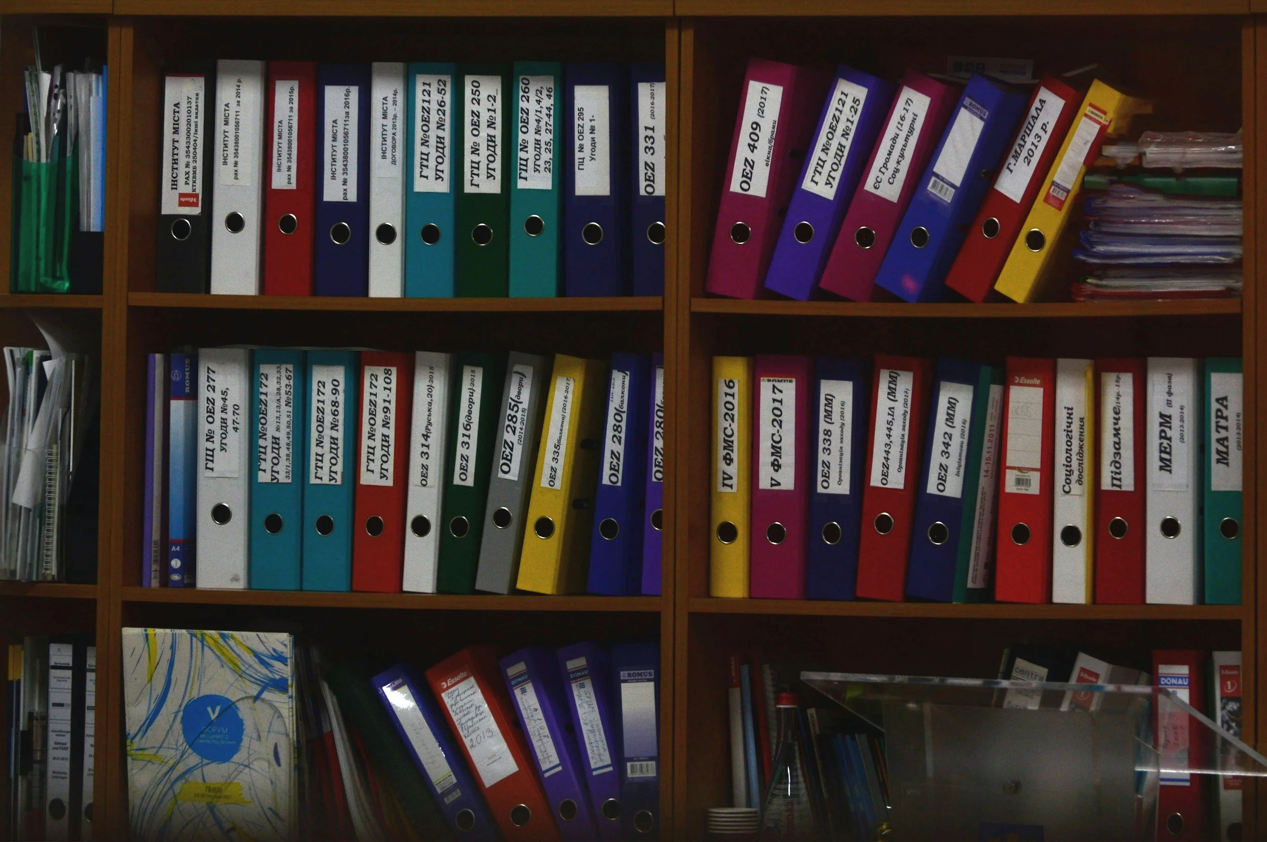
Is Your Website Organized for Your Visitors, or You?
When your website is organized around the way people naturally think, navigation becomes more intuitive, discovery becomes easier, and every interaction feels more purposeful.
Many websites are difficult to use not because of the visual design, but because of the way information is organized.
Too often, websites are structured around departments, business units, internal product names, or organizational charts because that’s how the organization thinks about itself. Visitors, however, arrive with a different goal. They’re trying to solve a problem, complete a task, or find the right product, service, or resource. They are not trying to understand how your organization is structured.
When information is organized around visitor goals instead of internal ownership, websites become easier to navigate, easier to understand, and more effective at helping people accomplish what they came to do.
Common User Experience (UX) Roadblocks
Building navigation around departments: Many websites organize their navigation according to internal departments or business units. Visitors, however, rarely know, or care, which team owns a particular service or resource. Instead, organize navigation around the questions, tasks, and goals visitors are trying to accomplish.
Using internal terminology: Internal product names, acronyms, and industry jargon often make perfect sense to employees but create unnecessary confusion for visitors. Choose labels and navigation terms your audience already understands and would naturally use when looking for information.
Separating related information across teams: When content is divided according to organizational ownership, visitors are often forced to move between multiple sections of the website to complete a single task. Group related information by purpose rather than by the department responsible for maintaining it.
Expecting visitors to learn your structure: Visitors shouldn't have to understand your organizational chart before they can find what they need. A well-designed information architecture helps people predict where information is located without requiring them to learn how your business operates.
Designing for the business instead of the customer: Internal priorities, reporting structures, and operational processes are important, but they shouldn't determine how visitors experience your website. Instead, let visitor needs, decision-making journeys, and common tasks shape the way your content is organized.
The result is a site that may make sense internally but feels fragmented to its users.
What the research tells us
Information architecture is one of the biggest factors influencing whether visitors can successfully find what they need.
Baymard Institute's 2025 Homepage & Category Navigation benchmark found that 58% of desktop websites and 67% of mobile websites provide only mediocre-to-poor homepage and category navigation experiences. Many of these usability problems stem from navigation structures and content organization that do not align with how visitors naturally look for information.
Across more than 200,000 hours of UX research, 4,400 moderated usability studies, 334 benchmarked e-commerce websites, 20,240 quantitative study participants, and more than 900 identified usability issues, Baymard repeatedly observed participants abandoning websites after failing to locate products that were actually available. The content existed, but the structure made it hard to find.
Baymard also found that many websites group large portions of their offerings under broad, generic navigation categories that reflect internal organizational structures more than the way visitors browse. When information is difficult to discover through navigation, visitors often assume it does not exist.
Although this research focuses on e-commerce, the same principle applies to healthcare organizations, consulting firms, software companies, universities, financial institutions, government agencies, nonprofits, and nearly every other type of organization. Visitors expect websites to be organized around their goals, not your org chart.
Why this matters
Visitors shouldn't need an introduction to your organization before they can use your website.
Organizations that organize information around customer goals create experiences that are easier to navigate, easier to understand, and more effective at helping people find relevant information. Instead of forcing visitors to translate internal terminology or navigate departmental boundaries, they provide a clear path from question to answer and from need to solution.
The best information architecture is almost invisible because it reflects the way visitors already think.
Three UX Priorities For Website Navigation & Structure
Priority #1: Organize around how visitors think
People do not arrive on your website knowing how your organization is structured. They do not know which department owns a service, what your internal terminology means, or how responsibilities are divided across teams. Instead, they rely on familiar patterns and prior experiences to predict where information should be located. When your website reflects those expectations, navigation feels intuitive.
Priority #2: Use language visitors already understand
Information architecture is not only about where content lives. It is also about how people recognize it. Navigation labels, category names, and page titles should use language your audience already knows. Visitors should not have to interpret acronyms, learn proprietary product names, or decode internal terminology before deciding where to click.
Priority #3: Organize information around visitor goals
Before designing your navigation, ask a simple question: What is the visitor trying to accomplish? That question often produces a very different structure than asking how your organization is organized. Group together the information people naturally need to complete a task, answer a question, or make a decision, even if different departments own that content internally.
A quick Website review
Review your website's navigation and overall structure, then ask yourself:
Does the website structure reflect how visitors think about their goals?
Would a first-time visitor predict where information is located?
Are navigation labels based on customer language rather than internal terminology?
Are related products, services, and resources grouped logically?
Could visitors complete common tasks without understanding your organizational structure?
Has your information architecture been validated through user research or usability testing?
Does the navigation prioritize visitor needs over internal ownership?
Are common tasks easy to begin?
Would someone unfamiliar with your organization know where to click first?
Does the website feel organized around customers rather than departments?
Your website's structure is the foundation of every visitor experience. When information is organized around the way people naturally think, visitors spend less time figuring out your website and more time accomplishing their goals.
Next Steps
If your website feels harder to navigate than it should, the problem may not be the amount of content. It may be how that content is organized.
I help organizations evaluate and restructure their information architecture so it aligns with how visitors actually think, search, and make decisions. That includes navigation design, content grouping, labeling systems, and overall site structure.
If you want your website to feel more intuitive for visitors, the first step is often not adding more content. It is organizing what you already have in a way people can actually use.
Let’s Work Together
If you’d like to explore working together, please complete the form with a few details about your project. I will review your message and get back to you within two business days.