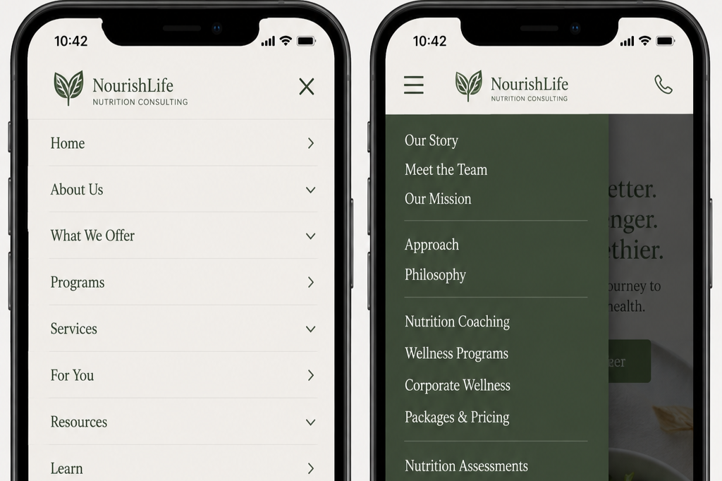
Your Website’s Mobile Navigation Should Behave the Way Visitors Expect
When menus behave the way visitors expect, people spend less time learning the interface and more time accomplishing what they came to do.
Visitors shouldn't have to learn how your navigation works before they can use your website.
On mobile devices, people rely on interaction patterns they've encountered across hundreds of other websites and apps. They expect menus to open in predictable ways, categories to behave consistently, and the Back button to return them to where they just were. When those expectations aren't met, even a well-organized navigation can become frustrating.
Every unexpected interaction requires additional effort. Should tapping this menu item open a page or expand a submenu? Why didn't the Back button return to the previous menu? How do I close this section?
These may seem like small moments, but they interrupt visitors as they're trying to accomplish a task. Instead of finding information, they're forced to figure out how your navigation works.
The best mobile navigation doesn't surprise visitors; it behaves exactly the way they expect.
Common User Experience (UX) Roadblocks
Using inconsistent menu behavior: Similar navigation elements should behave the same way throughout your website. When some menu items expand while others immediately navigate to a page without a clear pattern, visitors become less confident about what will happen next.
Breaking the Back button: Visitors expect the browser's Back button to retrace their steps. When custom navigation overrides this behavior or produces unexpected results, people can easily become disoriented or abandon the task altogether.
Making parent categories unpredictable:Parent categories should follow consistent interaction patterns. If expanding a section, opening a category page, or doing both behaves differently throughout the website, visitors have to stop and think before every interaction.
Hiding the visitor's location:Mobile navigation should clearly communicate where visitors are within the hierarchy. Without that context, it's harder to understand how sections relate to one another or return to previous levels.
Inventing new interaction patterns: Creative navigation may look distinctive, but familiar patterns almost always create a better experience. Rely on established mobile conventions so visitors can focus on their goals instead of learning a new interface.
What the research tells us
Baymard Institute's Homepage & Category Navigation research found that inconsistent mobile navigation is a common source of usability problems.
Its 2025 benchmark found that 67% of mobile e-commerce websites provide only mediocre or poor homepage and category navigation experiences.
One of the most common issues involves the browser's Back button. Baymard found that 59% of benchmarked websites violate at least one common expectation for how the Back button should behave, causing confusion and, in some cases, abandonment during moderated usability testing.
Orientation is another widespread challenge. Ninety-five percent of websites fail to indicate the visitor's current location within the navigation hierarchy, making it difficult for people to understand where they are or move efficiently between related sections.
Baymard also found that 60% of websites fail to organize navigation into manageable groups, increasing cognitive effort as visitors move through menus. In addition, 33% of websites do not make parent category headers clickable, violating many visitors' expectation that a parent category should both expand to reveal subcategories and provide access to the broader category page.
Across hundreds of moderated usability studies, Baymard consistently observed that visitors became disoriented when navigation interactions behaved differently than expected. Familiar, conventional navigation patterns consistently reduced effort and improved task completion.
Although this research focuses on e-commerce, the same principles apply to healthcare organizations, universities, nonprofits, government agencies, software companies, consulting firms, and virtually every other type of organization. Mobile visitors expect navigation to work the way they're accustomed to.
Why this matters
Visitors shouldn't have to think about how your navigation works.
Organizations that follow familiar mobile interaction patterns reduce cognitive effort, improve task completion, and create experiences that feel intuitive from the very first interaction. Rather than asking visitors to learn a unique interface, they build on conventions people already understand.
The best mobile navigation doesn't attract attention; it simply helps visitors reach their destination with confidence.
Three UX Priorities for Mobile Optimization
Priority #1: Follow established mobile conventions
Most visitors already know how mobile navigation should work. Use familiar menu icons, predictable expand-and-collapse behavior, standard browser interactions, and recognizable navigation patterns. When your navigation behaves as visitors expect, they can begin using it immediately without a learning curve.
Priority #2: Keep navigation behavior consistent
Consistency builds confidence. Navigation elements that perform the same function should always behave the same way. Whether visitors are expanding menus, selecting categories, or moving between sections, predictable interactions reduce hesitation and help people navigate more efficiently.
Priority #3: Help visitors stay oriented
Visitors should always know where they are and how they got there. Clearly indicate the current location within the navigation hierarchy, make it easy to return to previous levels, and ensure navigation transitions feel logical. Good orientation reduces frustration and helps visitors confidently continue exploring your website.
A quick website review
Review your website on a mobile device, then ask yourself:
Does navigation behave consistently throughout the website?
Can visitors easily tell how to expand or collapse sections?
Do parent categories behave predictably?
Does the browser Back button work as visitors expect?
Is the current location within the navigation hierarchy clear?
Can visitors easily return to previous levels?
Are navigation interactions familiar and conventional?
Are touch targets clear and easy to understand?
Is menu behavior consistent across different sections?
Would a first-time visitor understand how to navigate without instruction?
If several of these questions are difficult to answer, your mobile navigation may be creating unnecessary cognitive effort for visitors who simply want to find information.
Great mobile navigation feels familiar. When menus behave the way visitors expect, people spend less time learning the interface and more time accomplishing what they came to do.
Next Steps
If your mobile experience makes simple tasks harder than they should be, I can help you review where the friction is happening. I work with organizations to evaluate mobile navigation, page structure, and task flow so visitors can find what they need and complete what they came to do more easily.
Let’s Work Together
If you’d like to explore working together, please complete the form with a few details about your project. I will review your message and get back to you within two business days.