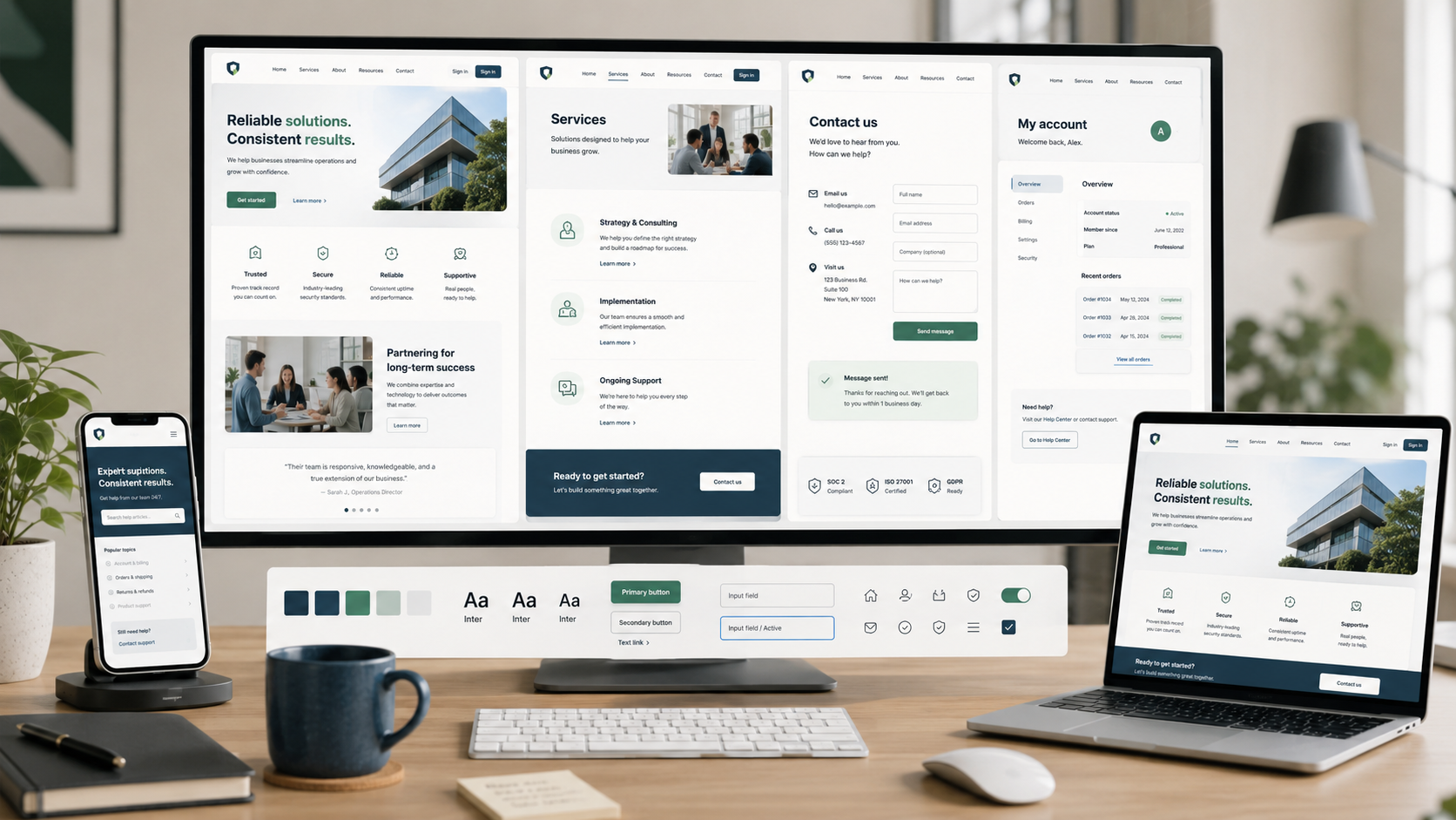
Site-Wide UX Best Practices
How to Create a Consistent, Reliable, and Trustworthy Website
Visitors experience your website as a whole. Even if individual pages function well, inconsistencies, outdated information, slow performance, broken features, unclear trust signals, or disruptive interruptions can make the overall experience feel unreliable.
A strong site-wide experience ensures continuity. Pages look and behave predictably, information is trustworthy, key tasks work reliably, and visitors know what to do if something goes wrong.
Below are nine site-wide UX best practices to consider when reviewing your website.
________________________
1. Keep the Website Consistent and Familiar
Ask yourself: Once visitors learn how my website works, can they rely on those patterns everywhere else?
Maintain consistent design, terminology, navigation, forms, buttons, and interaction patterns throughout the website.
If an action is labeled Sign In in one area, do not change it to Log In elsewhere. Primary buttons should use a consistent style so visitors do not need to relearn what a primary action looks like on different pages.
Follow familiar web conventions. Links should appear as links, buttons should be clearly clickable, common controls should be placed where visitors expect them, and standard browser behaviors should function as expected.
Consistency reduces the effort required for visitors to navigate the website.
Explore Why Design Consistency Matters Across Your Website >
2. Keep Information Accurate and Current
Ask yourself: Can visitors trust that the information on my website is still correct?
Outdated or conflicting information quickly undermines visitor confidence.
Regularly review key content such as pricing, products and services, business hours, contact details, policies, promotions, downloads, team information, and screenshots or demonstrations.
Ensure information is consistent across the website. Prices, policies, or contact details should not vary between pages.
Remove expired announcements and promotions, or clearly label them as historical content.
3. Make the Website Feel Fast, Responsive, and Stable
Ask yourself: Does the website respond quickly without making visitors wait or causing content to unexpectedly move?
Prioritize essential content and actions so visitors can engage with the page without waiting for secondary scripts, widgets, or other non-essential elements to load.
When an action takes time, provide clear feedback so visitors know their click or submission is being processed.
Prevent unexpected layout shifts. Images, banners, fonts, and other content should not move buttons or text while visitors are reading or interacting.
The experience should feel responsive and steady, not unpredictable.
4. Make Failures Easy to Recover From
Ask yourself: If something breaks, can visitors recover without losing their work?
Websites may occasionally have broken links, failed submissions, unavailable content, or technical errors.
Error messages should explain the issue in plain language and offer a clear next step. For example, a 404 page should provide navigation, search, and links to important destinations rather than becoming a dead end.
Preserve visitor input whenever possible. If a form fails, retain valid information. If a session is interrupted, maintain selections, saved items, or progress when appropriate.
Core functionality should work reliably across browsers, devices, screen sizes, and assistive technologies your visitors use.
A technical problem should not require visitors to start over.
5. Make the Organization and Help Easy to Find
Ask yourself: Can visitors easily tell who is behind the website and how to get help?
Ensure your organization’s identity and contact options are easy to find.
Depending on the organization, that might include:
Business or organization name
Contact page
Email
Phone number
Address or service area
Business or support hours
Help or support options
Visitors should not need to search the website to identify your organization or find contact information.
Set clear expectations for support. If you typically respond within one business day, state this. If different channels address different needs, explain that clearly.
Use the footer as a reliable secondary resource for contact information, policies, help, accessibility details, and other important links.
6. Build Trust Through Transparency
Ask yourself: Does my website give visitors enough information to make informed decisions without misleading or pressuring them?
Clearly communicate privacy and security practices where relevant.
If you request personal information, explain why it is needed and how it will be used. Make privacy information easy to find and consent choices clear.
Avoid manipulative patterns such as hidden fees, fake countdown timers, artificial scarcity, preselected unwanted add-ons, complex cancellation processes, or consent choices that make declining unnecessarily difficult.
Apply the same standard to claims and social proof. Testimonials, statistics, awards, credentials, client logos, and performance claims should be accurate, up to date, and supported by sufficient context for visitors to evaluate them.
Trust comes from transparency, not just reassurance.
7. Use Messages and Overlays Selectively
Ask yourself: Are popups, banners, alerts, and other global messages helping visitors rather than interrupting them?
Global messages can be useful for important information such as service disruptions, privacy choices, significant announcements, or time-sensitive updates. However, every overlay competes with the visitor’s current task.
Avoid stacking newsletter popups, cookie notices, promotional banners, chat widgets, surveys, and other interruptions.
Before adding a global message, consider whether it is important enough to interrupt the visitor’s current task. When overlays are necessary, ensure they are easy to understand, dismiss, and navigate without obscuring important content or actions.
8. Make Regional Settings Easy to Understand and Change
Ask yourself: If my website serves different regions, can visitors easily understand and control the settings that apply to them?
For websites serving multiple countries, languages, or regions, clearly indicate the visitor’s current context.
That may include:
Language
Country or region
Currency
Date formats
Measurements
Phone and address formats
Do not rely solely on flags to identify languages, and use formats that minimize ambiguity.
Visitors should be able to change relevant regional settings without losing their cart, form information, or other progress. Simple, locally focused websites may not need these controls at all.
9. Help Visitors Continue Across Devices and Sessions
Ask yourself: When appropriate, can visitors return later or switch devices without having to start over?
Many website journeys do not happen in a single visit. Someone might research a service on their phone, continue on a laptop, save an item for later, or return several days after beginning a task.
When the experience warrants it, preserve useful information such as:
Shopping carts
Saved items
Drafts
Preferences
Recent activity
Account state
For signed-in experiences, relevant information should remain consistent across devices and sessions as appropriate. Continuity should minimize repeated work while respecting privacy and security.
________________________
A Strong Site-Wide Experience Feels Dependable
Visitors should not need to question whether each new page will behave differently or whether the website can be trusted to function properly.
The experience should feel:
Consistent
Current
Responsive
Reliable
Transparent
Easy to recover from when something goes wrong
When these qualities are maintained across the website, individual pages feel like parts of a coherent experience rather than a collection of disconnected screens.
Next steps
If your website feels inconsistent, contains outdated information, loads unpredictably, makes errors difficult to recover from, or leaves visitors unsure about trusting your organization, site-wide issues may be causing unnecessary friction.
Fegan Consulting evaluates consistency, performance, reliability, trust, error recovery, and other site-wide experience patterns from an expert, accessibility-focused UX perspective. You receive clear, prioritized recommendations to make your website more dependable and easier to use, without defaulting to a costly redesign.
Let’s Work Together
If you’d like to explore working together, please complete the form with a few details about your project. I will review your message and get back to you within two business days.