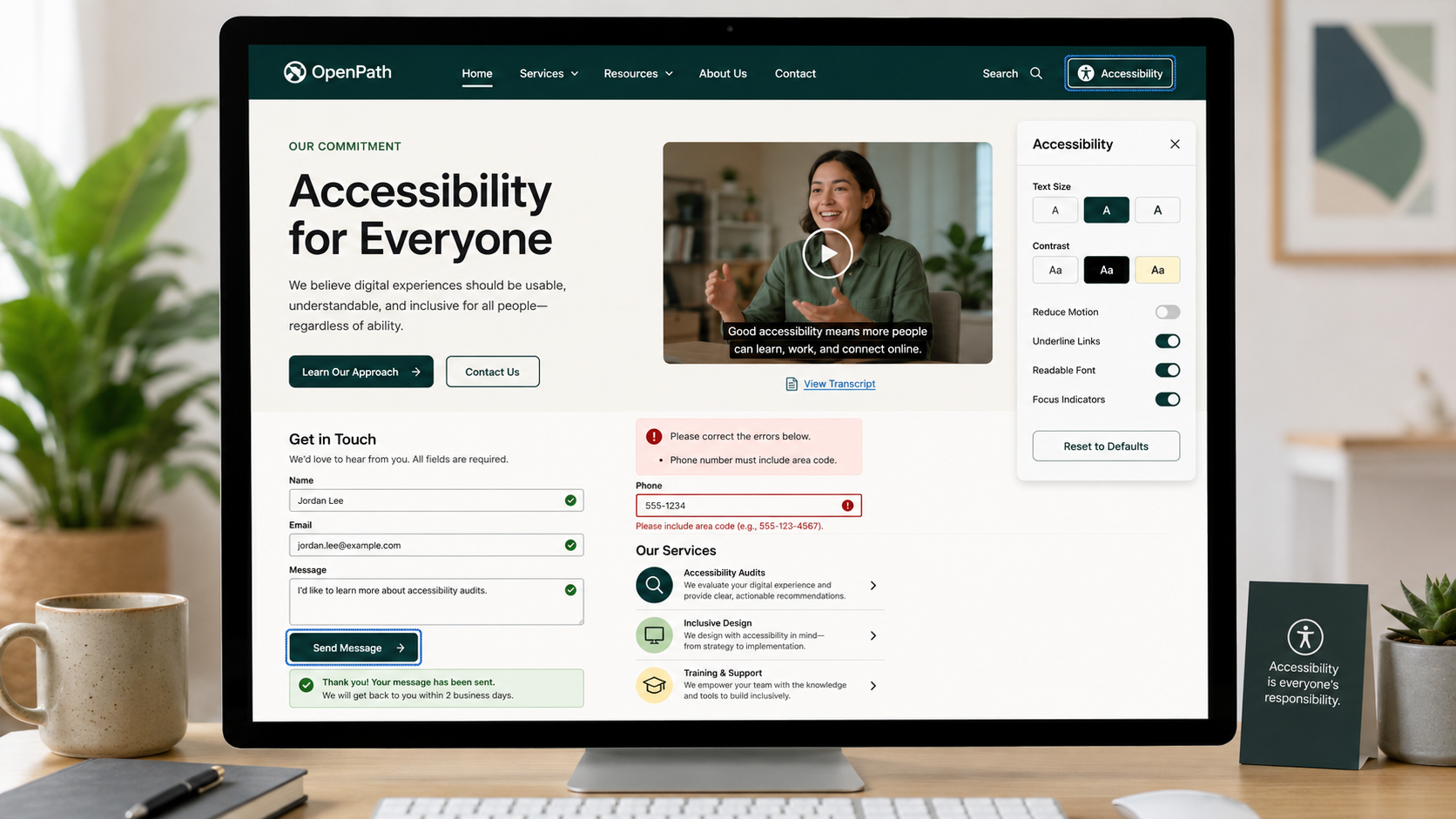
Website Accessibility Best Practices
How to Make Your Website Easier for More People to Use
Accessibility helps ensure that people with different visual, auditory, motor, and cognitive abilities can understand and use your website.
Many accessibility improvements benefit all users. Strong contrast aids those using phones in bright light. Captions assist when audio is unavailable. Clear labels minimize confusion. Keyboard-friendly features support both power users and those unable to use a mouse.
Accessibility is not about providing a separate experience for a few visitors. It is essential to building a website that serves a wider audience.
Consider these nine accessibility best practices when reviewing your website.
________________________
1. Make Content Easy to See and Understand
Ask yourself: Can visitors easily understand important information without difficulty seeing or interpreting visual cues?
Ensure text, buttons, form fields, icons, and other key elements have sufficient contrast with their backgrounds for easy visibility.
Do not rely on color alone to communicate meaning. For example, do not indicate a form error only with a red border. Also provide text or an icon explaining the issue. Ensure selected items, status indicators, charts, and links are understandable even if color differences are not visible.
A helpful test is: If the page is viewed in grayscale, does the important information remain clear?
Fix Low Contrast and Improve Accessibility >
2. Provide Alternatives for Images, Audio, and Video
Ask yourself: If someone cannot see an image or hear a video, can they still access its information?
Provide meaningful alternative text for informative images that conveys their purpose or meaning, not just their appearance.
Ensure decorative images are ignored by screen readers to avoid unnecessary distractions.
For audio and video, offer accurate captions, transcripts, and descriptions of key visual information.
The goal is to ensure important content remains accessible even if the original format cannot be used.
Write Alt Text That Truly Serves Your Visitors >
3. Let Visitors Resize and Zoom Without Breaking the Page
Ask yourself: Can visitors enlarge the website and still use all features comfortably?
Some visitors increase text size or use browser zoom to improve readability. The website should adapt without clipping text, hiding buttons, overlapping content, or requiring horizontal scrolling to read paragraphs.
Do not prevent visitors from zooming on mobile devices.
Layouts, menus, forms, and other interactive elements must remain usable when content is significantly enlarged.
4. Make the Website Usable Without a Mouse
Ask yourself: Can visitors complete key tasks using only a keyboard?
Visitors should be able to navigate menus, select options, complete forms, open dialogs, use media controls, and perform key actions without a mouse or touchscreen.
Keyboard interactions should be predictable. Visitors must be able to use Tab to move between controls, Enter or Space to activate them, and Escape to close overlays or dialogs.
Avoid keyboard traps that prevent users from exiting a component.
Test your website by completing a primary task using only the keyboard, without a mouse.
5. Help Keyboard Users Know Where They Are and Move Efficiently
Ask yourself: As visitors navigate with a keyboard, is their position on the page clear and predictable?
Keyboard users need a visible focus indicator to show which link, button, or field is active.
Focus should move through the page in a logical order that matches the visual layout. Unexpected jumps make navigation difficult.
On pages with repeated navigation or large content blocks, provide a way to skip directly to the main content. A Skip to Main Content link allows keyboard and screen reader users to bypass repeated navigation links on each page.
6. Give Visitors Control Over Motion and Timing
Ask yourself: Can visitors pause, stop, or avoid movement and time limits that may interfere with website use?
Automatically moving content can make a website harder to read and may cause discomfort for some users.
Carousels, animations, videos, and other moving content should offer controls if they play automatically. Respect visitors who have enabled reduced-motion preferences on their devices.
If a form, checkout, or other task has a time limit, warn visitors before expiration and provide a way to extend the session when possible.
Avoid flashing, aggressive parallax effects, or unnecessary motion that distracts from content.
7. Use Clear Headings, Labels, and Instructions
Ask yourself: Can visitors quickly understand the page structure and the function of each control?
Use descriptive headings to organize content and provide clear labels for fields, links, buttons, and other controls.
Avoid vague labels like Click Here, More, or Submit. Use specific descriptions that explain the destination or outcome.
Headings should follow a logical structure so that screen reader users can understand how sections relate.
Clear wording benefits all users, especially those navigating without the visual layout.
8. Make Forms and Errors Easy to Understand
Ask yourself: Do visitors know what information is required and how to recover from errors?
Forms should clearly state required information, expected formats, and important instructions before visitors begin.
Do not use disappearing placeholder text as the only label or wait until an error occurs to explain requirements.
When an error occurs:
Identify the specific problem
Explain how to fix it
Associate the message with the affected field
Do not rely on color alone
Preserve other valid information whenever possible
Generic messages like Invalid Input or a red border alone do not provide enough information for visitors to recover.
9. Make Sure Assistive Technology Can Understand the Interface
Ask yourself: Does the website communicate its structure, controls, and changes to visitors who cannot see the interface?
A website may appear correct visually but still be difficult or impossible for assistive technology to interpret.
Use proper semantic structure for headings, navigation, lists, forms, buttons, and other interface elements. Interactive controls must have accessible names that clearly describe their function.
Communicate dynamic changes to users as they occur. When a visitor adds an item to a cart, applies a filter, encounters an error, opens a dialog, or waits for content to load, screen reader users should receive meaningful feedback about the change.
Accessibility depends on both visible content and what the website communicates to assistive technologies.
________________________
A More Accessible Website Is Usually a More Usable Website
Accessibility is not just about meeting technical requirements. It is about removing barriers.
Visitors should be able to:
Read and understand the content
Navigate using the tools that work for them
Complete forms and important tasks
Understand what is happening when the website changes
Access the same meaningful information regardless of ability or device
Many of these practices improve usability for all users, making the website clearer, more predictable, and easier to use.
Next steps
If your website has hard-to-read text, inaccessible media, confusing forms, keyboard barriers, or interactions that do not work with assistive technology, accessibility issues may prevent some visitors from completing important tasks.
Fegan Consulting evaluates accessibility as part of the overall user experience, identifying barriers that affect how visitors perceive, navigate, understand, and interact with your website. You receive clear, prioritized recommendations to make the experience more inclusive and easier to use, without requiring a costly redesign.
Let’s Work Together
If you’d like to explore working together, please complete the form with a few details about your project. I will review your message and get back to you within two business days.