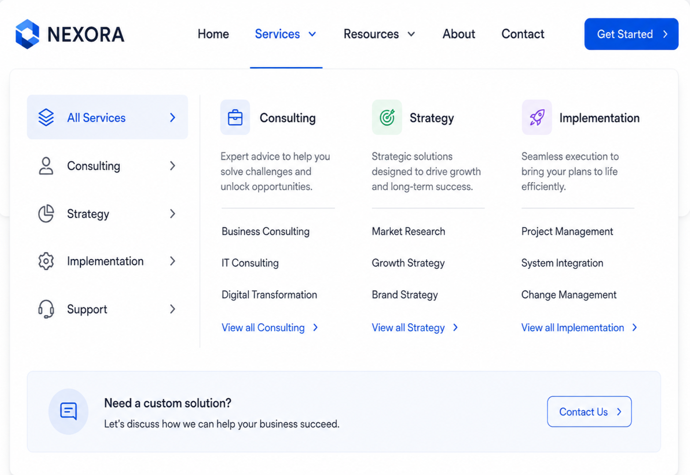
Is Your Website Too Deep Or Too Broad?
When your navigation balances breadth and depth, people spend less time figuring out where to click and more time engaging with the products, services, and information they came to find.
The way your website is organized directly affects how easily visitors can find information.
Some websites bury important content beneath multiple layers of navigation, forcing visitors to click through section after section before reaching what they need. Others take the opposite approach, presenting dozens of choices in a single menu and expecting visitors to sort through them all at once.
Neither approach creates a good user experience.
Visitors expect each step of navigation to bring them closer to their goal. Broad categories should gradually become more specific, helping people narrow their choices without feeling overwhelmed or losing momentum. When a website presents too many options at once, or requires too many steps to reach important content, it creates unnecessary effort.
The best information hierarchies strike the right balance between breadth and depth, making it easy for visitors to understand where they are, where to go next, and how to find the information they need.
Common information architecture & User Experience (UX) Roadblocks
Burying important content too deeply:High-value pages shouldn't require visitors to navigate through multiple levels before they can find them. Make your most important information easy to reach from the homepage and primary navigation.
Creating overwhelming navigation menus: Long lists of categories and subcategories force visitors to compare too many options at once. Break large collections into meaningful groups that are easier to scan and understand.
Using categories with only a single page:Every level of navigation should serve a purpose. If a category contains only one page, consider simplifying the hierarchy by removing unnecessary layers.
Placing everything under one broad section:Large sections that contain dozens of unrelated pages make it difficult for visitors to predict where information belongs. Introduce additional structure when it improves discoverability.
Treating every page as equally important: Not every page deserves the same level of visibility. Build your hierarchy around visitor priorities so the most important destinations are always the easiest to find.
What the research tells us
Baymard Institute's research shows that both overly broad and overly deep navigation structures create significant usability problems.
Its Homepage & Category Navigation benchmark found that 60% of e-commerce websites fail to divide large navigation hierarchies into manageable groups. During moderated usability testing, participants frequently described long lists of categories and subcategories as overwhelming, cluttered, and confusing. Baymard observed that many users begin to feel overloaded when they're presented with more than about 10 subcategory options at a time.
The opposite problem is just as common. Baymard found that more than 30% of benchmarked websites bury their entire product catalog beneath a single top-level navigation item, forcing visitors through unnecessary levels before they can begin exploring.
These issues contribute to a broader navigation challenge. Baymard's 2025 benchmark found that 58% of desktop websites and 67% of mobile websites provide only mediocre or poor homepage and category navigation experiences.
Academic research in human-computer interaction reaches the same conclusion. Studies consistently show that both excessively broad and excessively deep navigation structures reduce efficiency. The most effective websites balance the number of choices presented at each level with the number of steps required to reach the desired content.
Although much of this research comes from e-commerce, the same principles apply to healthcare organizations, universities, nonprofits, government agencies, software companies, consulting firms, and virtually every other type of organization. Every website benefits from a navigation structure that feels logical, manageable, and predictable.
Why this matters
Visitors shouldn't have to choose between navigating through endless menus or clicking through endless levels.
Organizations that balance breadth and depth create websites that are easier to explore, reduce navigation errors, and help visitors reach important information more efficiently. Instead of overwhelming people with too many choices or hiding content behind unnecessary clicks, they create information architectures that support confident exploration from the very first interaction.
The best navigation structures don't simply organize content; they make finding it feel effortless.
Three UX Priorities For Website Navigation & Structure
Priority #1: Make important content easy to reach
Visitors come to your website with specific goals. Your highest-priority products, services, resources, and actions should be accessible without requiring visitors to navigate multiple layers of menus. Review your hierarchy regularly to ensure the pages that matter most remain easy to find.
Priority #2: Present manageable choices
Good navigation helps visitors make one simple decision at a time. Rather than presenting dozens of options in a single menu, organize related content into meaningful groups that gradually narrow the available choices. Smaller, well-organized menus reduce cognitive effort and make browsing feel more natural.
Priority #3: Match the hierarchy to your content
Every website needs a different balance of breadth and depth. Smaller websites may require only a few navigation levels, while larger websites benefit from additional structure. Build your hierarchy around the complexity of your content and the way visitors naturally look for information—not around your organization's internal structure.
A quick Website review
Review your website's navigation and overall structure, then ask yourself:
Can visitors reach important content without excessive navigation?
Are menu choices grouped into manageable sets?
Does each navigation level meaningfully narrow the available options?
Are categories balanced rather than excessively broad or deep?
Could visitors predict what each category contains?
Does the hierarchy support efficient browsing on both desktop and mobile?
Are important pages buried beneath unnecessary levels?
Do any menus contain an overwhelming number of choices?
Does each navigation step move visitors closer to the visitor's goal?
Would a first-time visitor understand how the website is organized?
If several of these questions are difficult to answer, your information architecture may be creating unnecessary effort before visitors ever reach your content.
A great information hierarchy helps visitors move forward with confidence. When your navigation balances breadth and depth, people spend less time figuring out where to click and more time engaging with the products, services, and information they came to find.
Next Steps
If your website feels harder to navigate than it should, the problem may not be the amount of content. It may be how that content is organized.
I help organizations evaluate and restructure their information architecture so it aligns with how visitors actually think, search, and make decisions. That includes navigation design, content grouping, labeling systems, and overall site structure.
If you want your website to feel more intuitive for visitors, the first step is often not adding more content. It is organizing what you already have in a way people can actually use.
Let’s Work Together
If you’d like to explore working together, please complete the form with a few details about your project. I will review your message and get back to you within two business days.